This article covers two related reports under the Reports menu: Sent Mail Overview, which tracks how much you've sent and through which channels, and Email Activity, which tracks what happened to the email deliveries specifically.
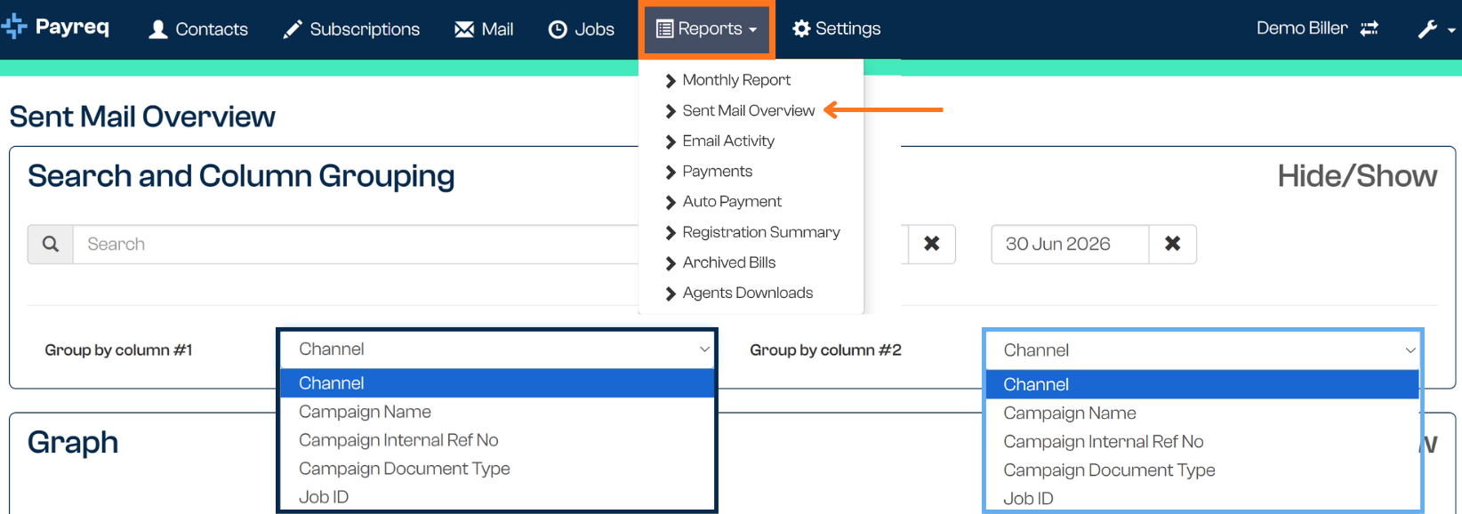
Sent Mail Overview
Sent Mail Overview lets you search and cross-reference sent volumes using two grouping columns, with results shown as a bar chart rather than a data table.
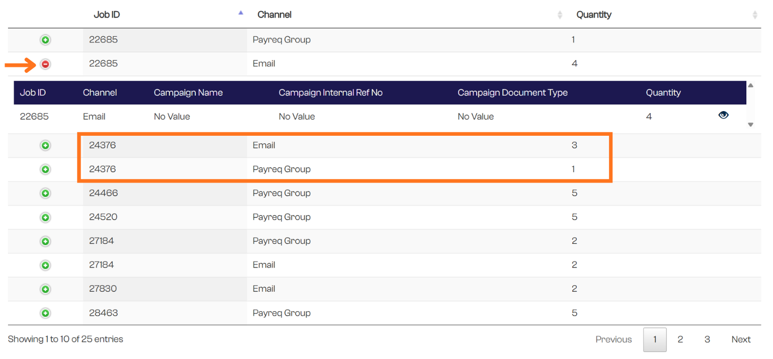
The search bar searches across the same fields available as column options, and can be refined by date if required. You then choose what to group by using two column selectors:
- Column 1 and Column 2 can each be set to: Channel, Campaign name, Campaign internal ref no, Campaign doc type, or Job ID.
- Column 2 also has a No Grouping option, if you only want to see a single field from Column 1 rather than a cross-reference.
The result is a document count for each cross-referenced combination of the two fields you chose. For example, searching Campaign Doc Type "Rate Notice" with Job ID in Column 1 and Channel in Column 2 returns every Rate Notice Job, showing how many documents in each Job went out via each channel — similar in spirit to the Billing Detail Report, but presented as a chart you can expand for more detail rather than a CSV export.
Results aren't available as a CSV export — this report is a visual, exploratory tool rather than a source of raw data for reconciliation. For that, use the Billing Summary Report or Billing Detail Report.
Email Activity
Email Activity is a simplified, visual view of email delivery outcomes. Search by Job ID or a date range, and it displays two graphs:
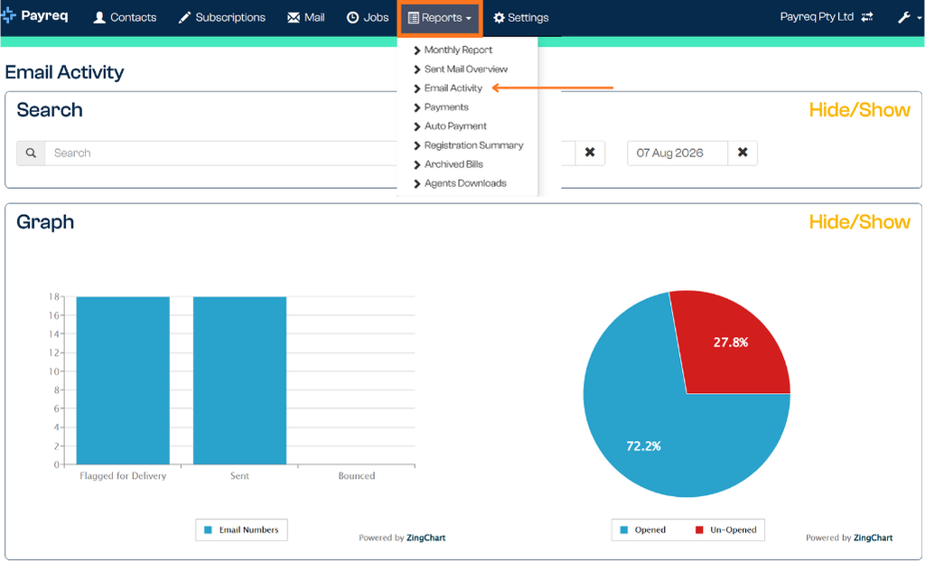
- Volume graph— a bar chart with three columns:
- Flagged for delivery: documents awaiting review, in the process of dispatching, or scheduled for a re-send attempt following a "soft" or "transient" bounce.
- Sent: confirms successful delivery.
- Bounced: the total number of bounces.
- Opened rate — a pie chart showing the volume of Opened vs Unopened emails.
These graphs are general, visual representations only and aren't available for CSV download. For more detailed, exportable figures, use the Monthly Reports. For managing bounced mail specifically, use the undeliverable mail management tools on the Mail tab.
This is useful for a quick read on what happened after an email was sent — not just whether it left Payreq, but whether it was delivered and opened. If you're chasing why a customer says they didn't receive something, this is a reasonable place to check before escalating.
How this differs from the Mail tab
The Mail tab already shows delivery and read information for individual documents (see Navigating the Mail page and Understanding Mail statuses). These two reports give you the same kind of information at an aggregate, account-wide level instead of one document at a time — useful for spotting trends or account-level issues rather than investigating a single bill.
Related articles
Was this article helpful?
That’s Great!
Thank you for your feedback
Sorry! We couldn't be helpful
Thank you for your feedback
Feedback sent
We appreciate your effort and will try to fix the article